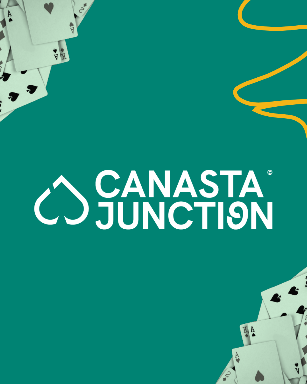
Canasta Junction is Getting a Makeover!
Big news for all Canasta lovers!
Canasta Junction is evolving with a fresh new look while keeping the same great game experience you know and love. Our brand refresh brings an updated logo, a more vibrant color scheme, and a modernized identity that reflects the energy and passion of our Canasta community. Here’s what you need to know about these exciting changes!

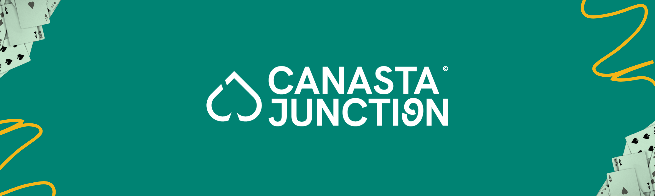
A fresh take on CJ iconic logo
Our new logo keeps the essence of Canasta Junction intact, but with a sleek, modern twist. You’ll still recognize the iconic spade at the center, subtly formed by the letters C and J, a signature design that represents strategy, skill, and the thrill of the game. This refined logo enhances our brand identity while staying true to the elements that make Canasta Junction unique.
Brighter, more dynamic colors
Along with our refreshed logo, Canasta Junction is adopting a bolder, more energetic color palette. This update is designed to make our game feel even more engaging, fun, and accessible to both new players and long-time fans. Our goal is to bring a fresh, modern vibe to every aspect of Canasta Junction while keeping its familiar warmth and community-driven spirit.
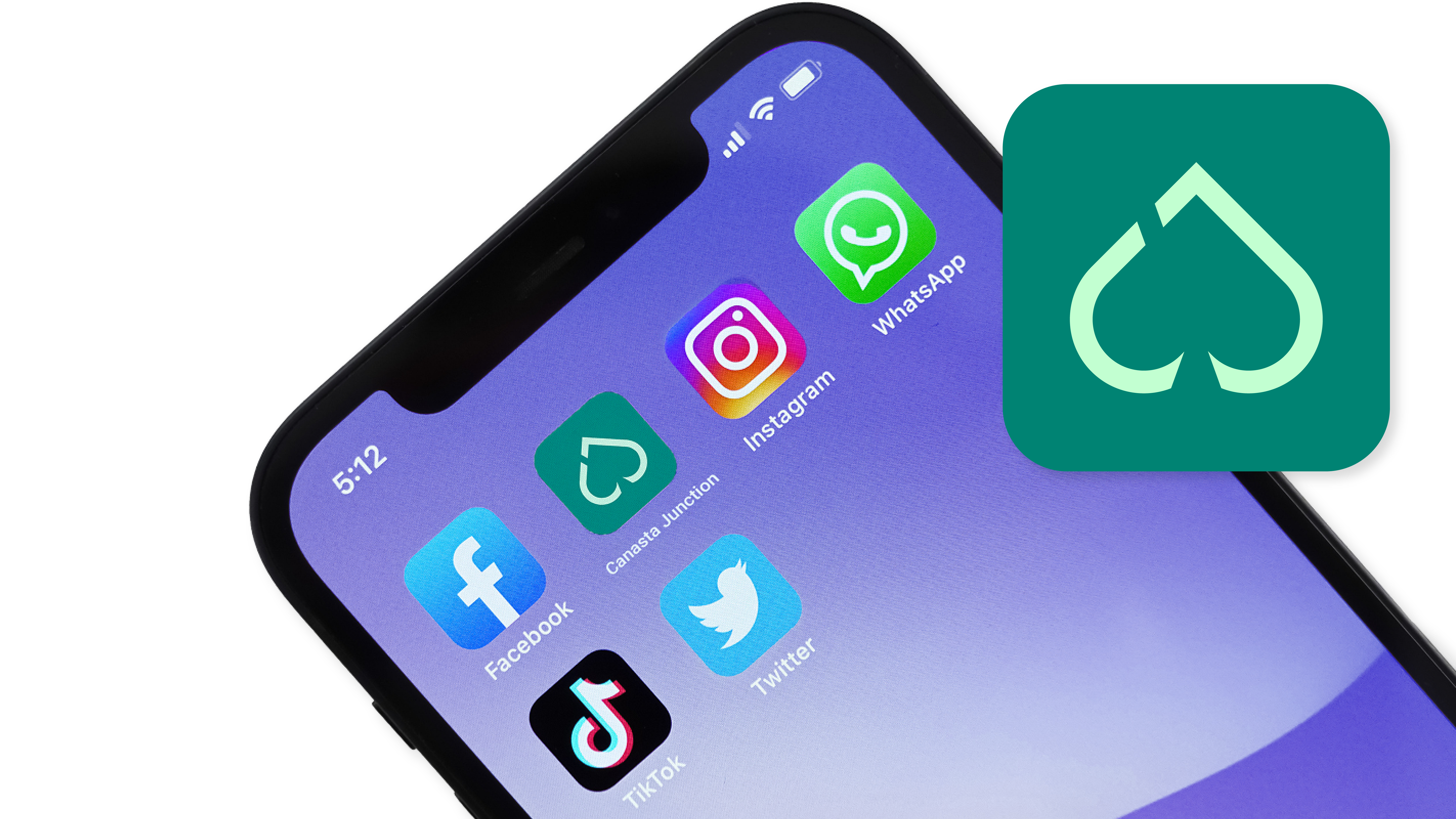
A New App Icon is Coming Soon!
With the next app update, our app icon will also get a new look! When you open Canasta Junction, you’ll see a refreshed, modernized icon that aligns with our new branding. This is just one of many exciting updates to come, all designed to enhance your experience while preserving the classic Canasta Junction feel you love.

Rolling Out the Changes: Where and When?
The quality and functionality of Canasta Junction won’t be impacted, ensuring that you continue to enjoy seamless, uninterrupted play.
What’s Next?
The first places you’ll notice our new branding are on our website, social media, and emails. As we gradually roll out updates, you’ll soon start seeing these changes in the Canasta Junction app as well. But don’t worry—while the visuals are getting a makeover, your gameplay experience will remain exactly the same!
This is just the beginning of Canasta Junction’s evolution. Over the coming months, we’ll continue refining our app’s visual identity while introducing small improvements that make gameplay even smoother—all without changing the way you play!

We can’t wait for you to experience the new look of Canasta Junction. Stay tuned for the first official app updates, and in the meantime, check out our refreshed branding on social media and our website!
What do you think of the new design? We’d love to hear your thoughts! Join the conversation on our social media channels and let us know.